Branding Projects

Providence Community Housing needed a new brand identity to both set it apart from other real estate development organizations and to drive home their core mission of continuing to enhance the lives of the residents that inhabit their housing developments far after they’ve completed construction and occupied the available housing units. The logo uses a warm but polished approach that has “heart”. The blue represents Providence itself which encompasses both the hearts of the residents (the orange heart) and the housing development itself (the green house).
Creative Direction : Graphic Design


This was a new orthodontic practice concept which opened in Orlando, FL. With interactive floor projected games, recording studios and photo booths, it comes off as more of an arcade where you are also able to receive orthodontic treatment and the brand needed to show this. The new brand that was created set the tone for the entire atmosphere of the office.
Creative Direction : Graphic Design


A Catholic high school had struggled to establish strong brand cohesion and presence in the city. The new brand brought in elements of the old and combined them with the new to create this timeless brand mark. The Crescent Moon, their mascot, is worked into the new mark as well. This branding project also included the creation of a new tagline/branding concept, “Find Friendship, Find Faith, Find Your Future! Find Yourself at Cabrini!”
Creative Direction : Graphic Design : Copywriting


A new STEM hub needed a mark establishing it as provider of educational opportunities that connects students to possible career paths. Rather than use the standard icons that most STEM logos utilize, this mark uses the letters within the acronym to create icons that represent the four areas of study: Science, Technology, Engineering and Math.
Creative Direction : Graphic Design


Southkick is headed up by a southern girl with a little “kick” to her. They specialize in historic restorations and renovations and needed a mark that felt both classic but with a little “kick” to it. It needed to feel youthful and modern but still pay homage to the historic properties that Southkick works on. Architectural details are the inspiration for the icon and the script of the word mark has a little “kick” to the end of it.
Creative Direction : Graphic Design


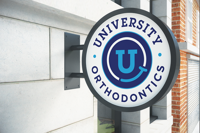
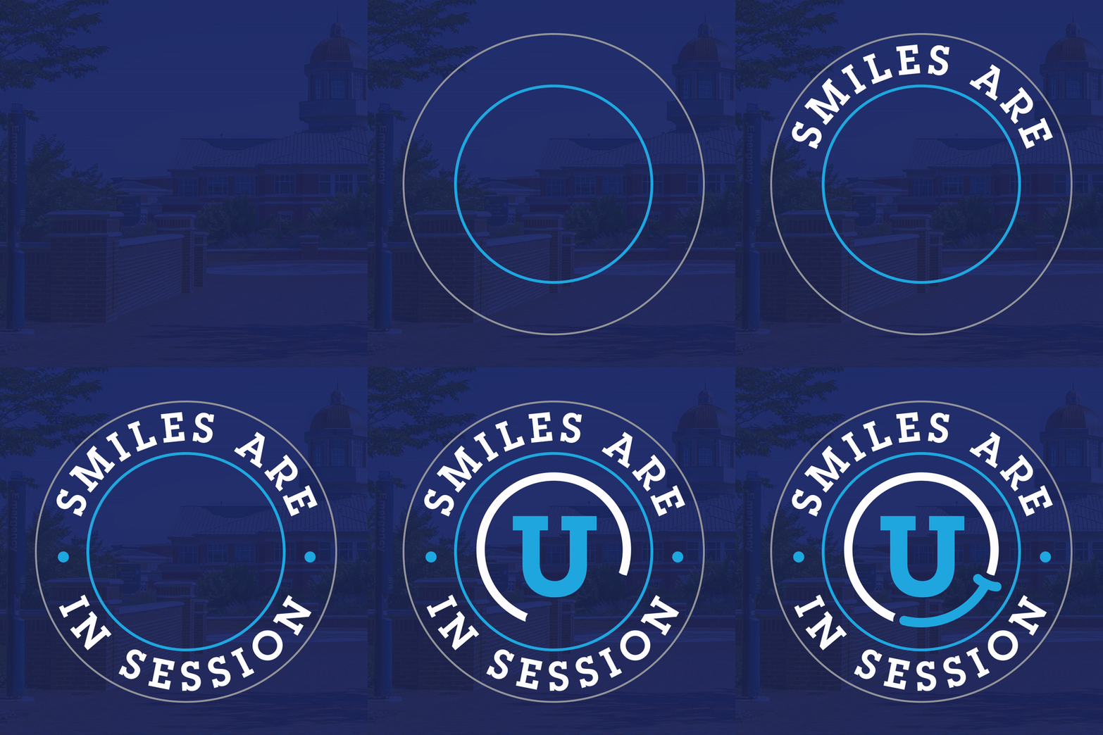
An orthodontic office near a large university needed a mark that looked both collegiate and fun to appeal to its audience. The stand alone icon as well as the circular seal application gave this logo many uses, just as a university logo would.
Creative Direction : Graphic Design


